Launched | User Acquisition | Mobile Design | UX/UI
Designing a User Acquisition Campaign for a Custom Keyboard App

Overview
The Opportunity
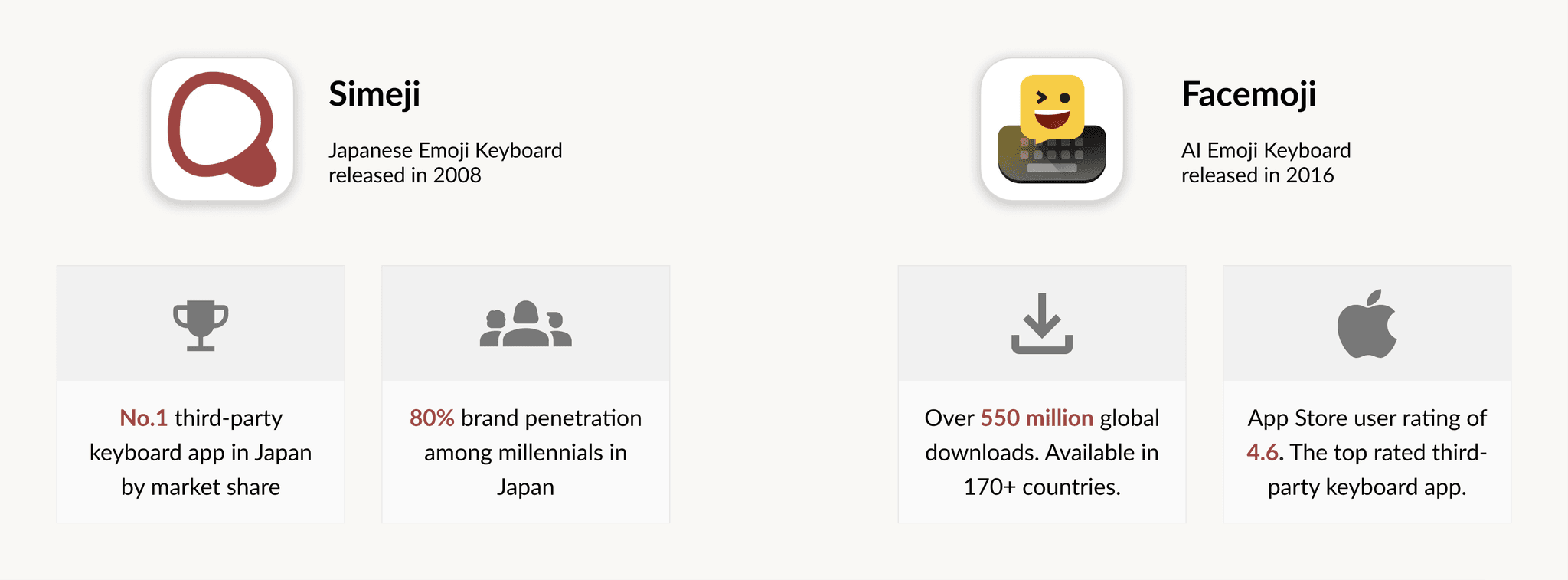
As the leading third-party keyboard app in Japan on both iOS and Android, Simeji has 11 million daily active users, which is 9% of Japan’s population. The Simeji brand is recognized by over 80% of Japanese millennials.
Previously, Simeji held two one-hour lucky draws, attracting 3,000 new users with a day-one retention rate of 50%. Building on this user behavior, our goal is to launch a user acquisition campaign leveraging the lucky draw mechanism to expand our user base.
The Solution
We launched a user acquisition campaign in Q3 2021 with impressive results:
500+
New sign-ups per day during the campaign
70%
Day-1 retention rate for new users
CONTEXT
Simeji Design Team @ Baidu Global business Unit
May — June 2021
MY ROLE
Led interaction design, user flow, wireframing, prototyping.
Contributed in visual design and design handoff.
TEAM
1 Project Manager
1 Design Manager
1 Product Design Intern
1 Visual Designer
Engineering Team
TOOLS
Figma, Miro, Jira, Notion
CONTEXT
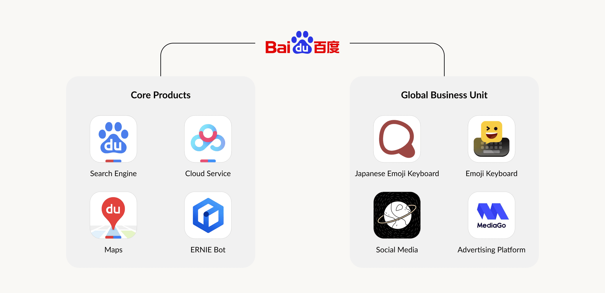
Baidu offers a wide range of products and services
Baidu operates the largest search engine in China. The company also offers a wide range of products, such as maps, Cloud services, and generative AI product.
I was a product design intern in Baidu’s Global Business Unit (GBU). The GBU’s main responsibilities are to expand the global footprint of Baidu’s products, with a wide variety of products and services for both end users and businesses.
Introducing Baidu’s two popular keyboard apps
Baidu has launched two popular keyboard apps in global markets.
Based on the user reception, the product team realized keyboards are extremely popular among young people.
More than 57% of the users are female under 30 years old
Why do they like Simeji? According to the research conducted by our marketing team in Japan, our users like keyboard app because it’s highly personal, intimate and customizable. Users will change their keyboard skins for different look and feel, this is like an expression of their personality.
business goal
Target a new user group to increase our user base
In the past, Simeji held 2 rounds of luck draws for 1 hour each, and got 3K new users. The new user retention rate on day 1 was 50%. Based on this user behavior, we believe lucky draws are a good opportunity to attract more users.
So, how do we achieve this business goal?
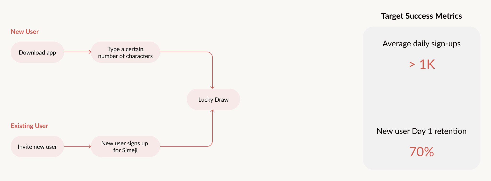
What kind of reward mechanism can make users excited? We want to continue to use the lucky draw to bring in new users. After discussing with product managers, we decided on two ways for users to participate in lucky draws. On top of that, to help the product team measure the success of this user acquisition campaign, we’ve set some target metrics.
VALIDATE ORIGINAL DESIGN
I joined this project when the original design was created by another designer
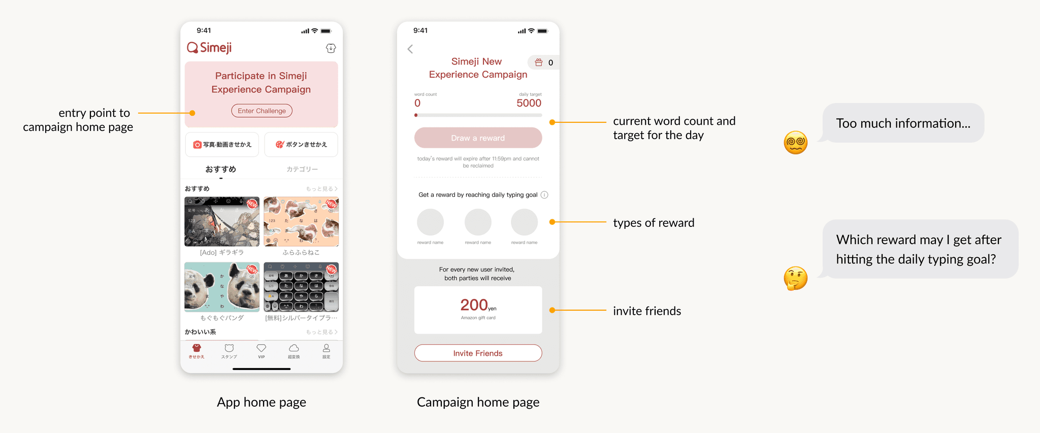
I kicked things off by analyzing the current design and discussing with the team, including designers, developers, and product managers. We did a quick validation of the existing layout and found a few usability issues:
having two types of rewards on the same page is confusing for users.
the current page has too much information.
So, we decided it’s time to redesign the campaign home page to make it clearer and more user-friendly.
ideation
Design explorations | campaign home page
I explored different design options for the campaign home page and came up with three versions. To get some feedback, I shared these low-fi designs with my product manager.
New findings: current mission is too easy to achieve
We had new findings that the current design makes it too easy to complete the daily typing mission. Since we have a budget cap of $10K, and we want to attract new users who are motivated by rewards, our budget could quickly run out if users can claim rewards every day.
“So, how can we redesign the user flow to encourage existing users to share the campaign with new users?”
User flow | before
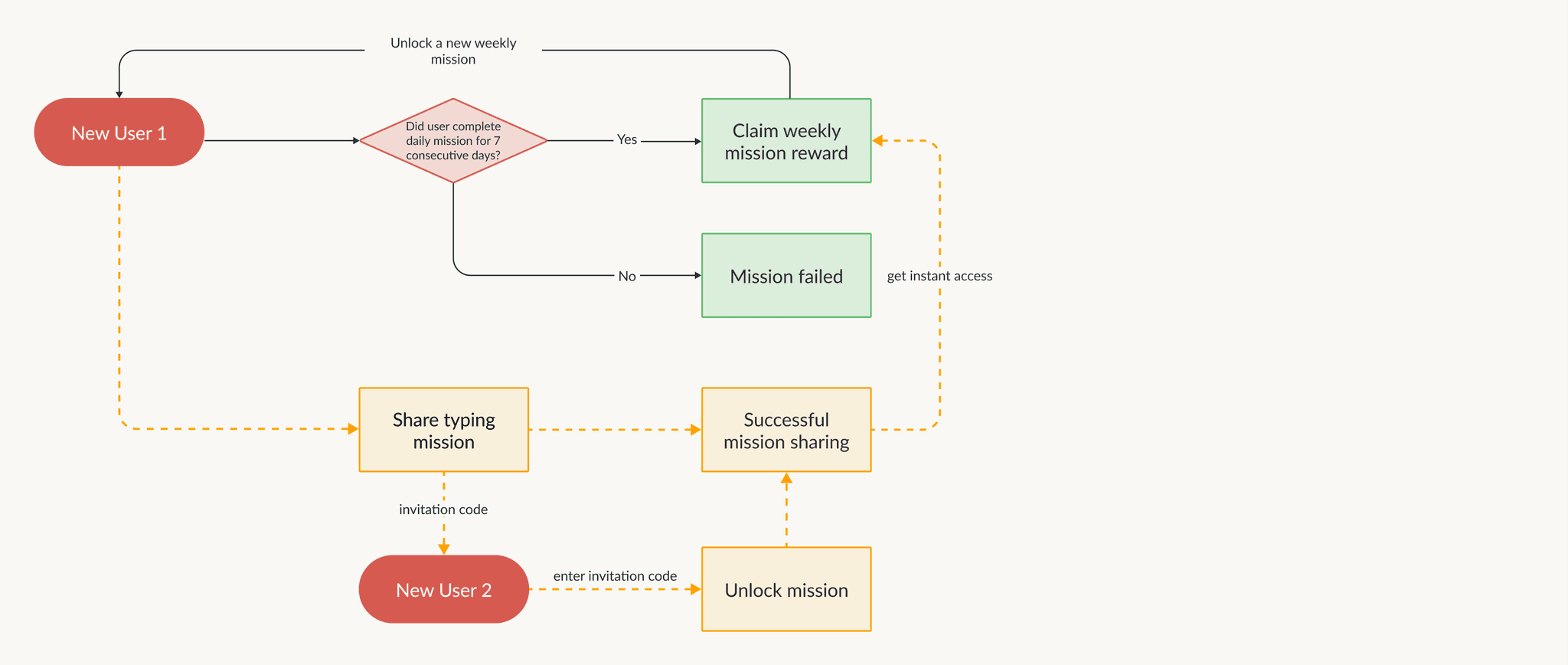
Here's the original user flow: users can claim rewards immediately after completing the daily mission, and they can enter the daily typing mission multiple times during the campaign.
User flow iteration 1 | make it harder to complete mission
After discussing with the PM, I came up with a new user flow. First, to add some challenge, I changed the daily typing mission to a weekly mission: users need to complete the typing mission for seven consecutive days to get a chance to draw a reward.
User flow iteration 2 | add sharing mechanism for quick rewards
Secondly, to motivate users to share the campaign, I designed a mechanism that speeds up getting the weekly rewards. Every time an existing user invites a friend to sign up for Simeji, both of them get an immediate access to draw a reward. This user-share shortcut aims to encourage spontaneous sharing of the campaign.
design development
Redesign key screens
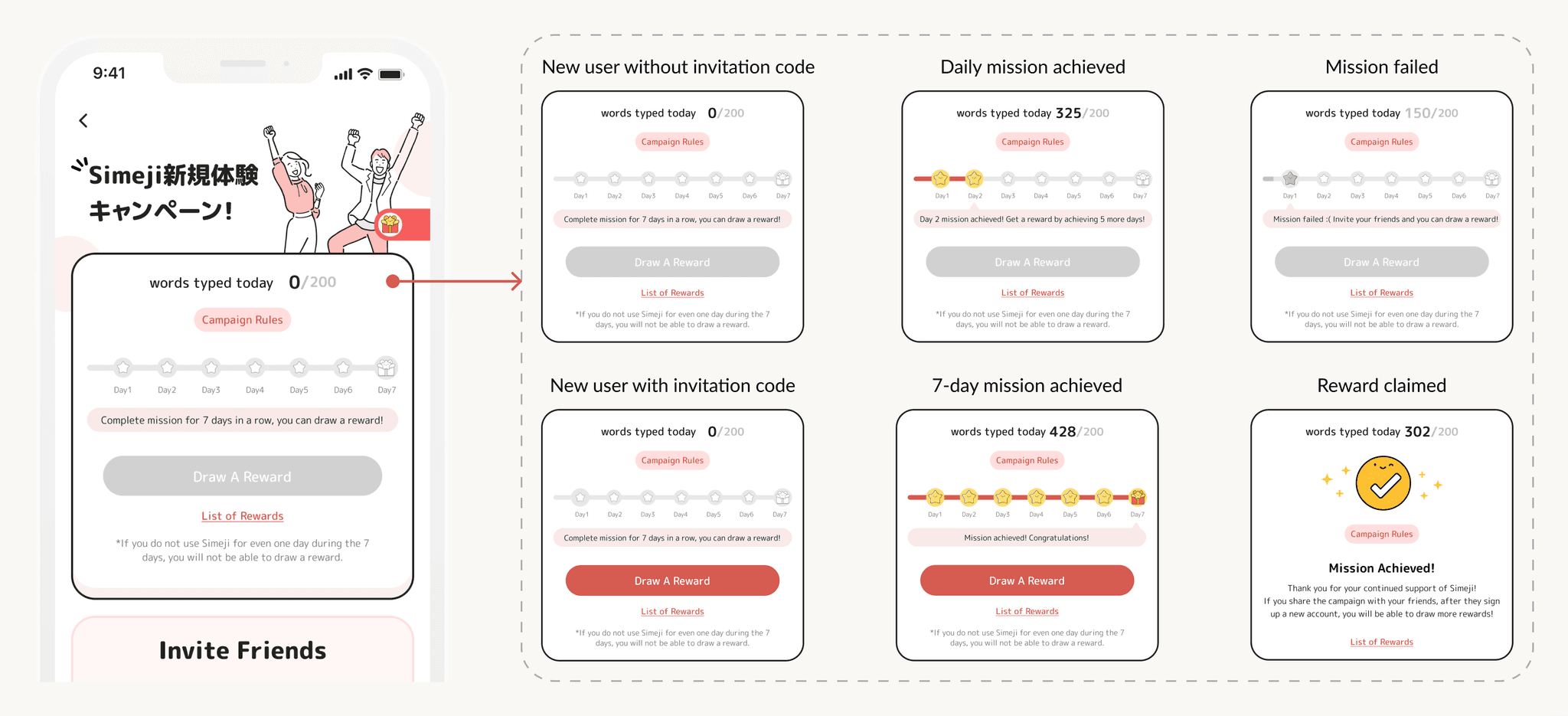
With the new user flow in mind, I redesigned the campaign homepage and the rules page. The homepage now has two main sections:
In the top half, the user can track their progress on the weekly challenge and draw a reward. The bottom half explains how users can speed up earning their weekly reward by inviting friends to sign up for Simeji.
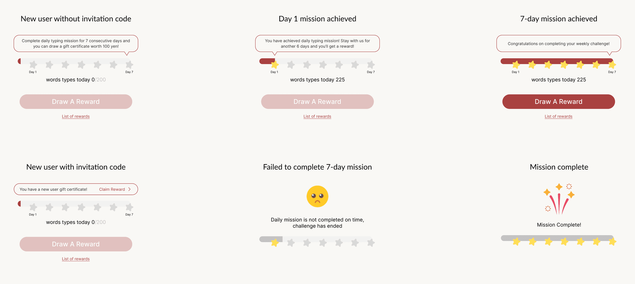
Use cases of progress
To address different stages of user progress, I designed specific screens that users will see throughout their weekly challenge.
Usability testing with 8 participants
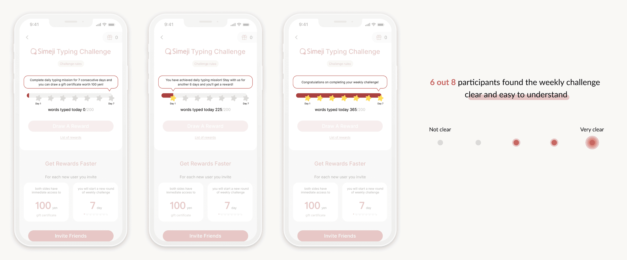
As a product design intern, my schedule is packed, and we don't have the budget or access to our end users for testing. However, it's crucial to ensure that the new campaign homepage and progress screens are clear. So, I conducted user testing with 8 employees from the company.
I asked each participant 2 questions:
On a scale from not clear to to very clear, how would you rate your understanding of the weekly challenge?
On a scale from not clear to very clear, how do you feel about the rule of sharing the campaign to receive instant rewards?
Gamify the screens
To make the campaign homepage more engaging, I teamed up with a visual designer to add gamification elements.
Redesign “share campaign” section
However, participants felt that the share campaign section had too much content and was hard to understand. Taking this feedback into account, I created a new detail page specifically for the share campaign rules. I simplified the share section on the campaign homepage and added a button that directs users to the new detail page. Additionally, I collaborated with the local copy team to translate the campaign rules into Japanese.
final design
What does sharing campaign flow look like?
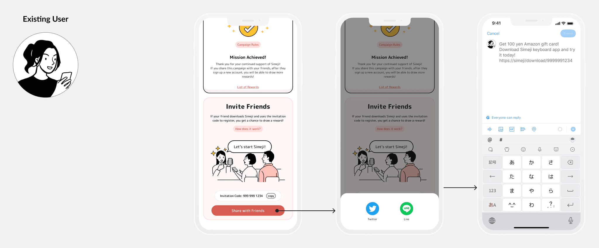
For existing users, after tapping “share with friends”, they can choose to share the campaign on Twitter or Line.
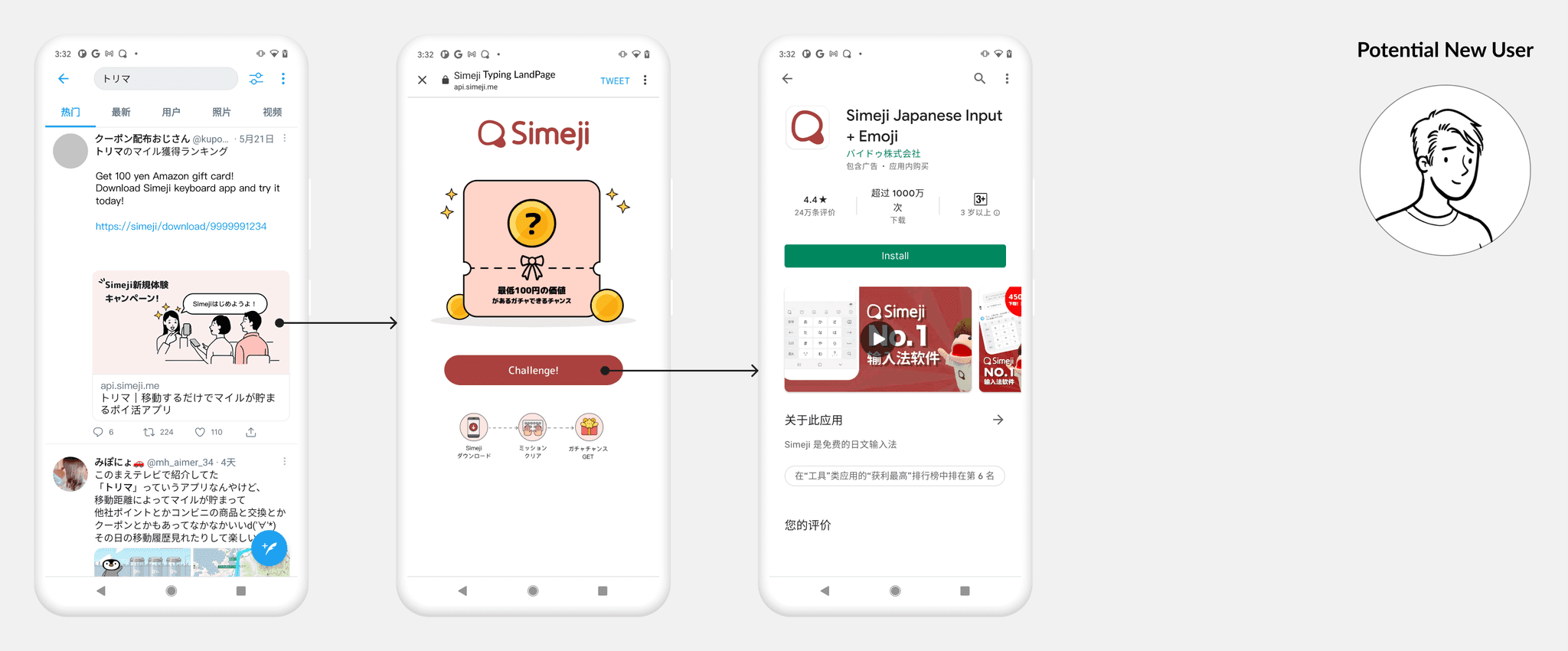
When Twitter users see the post, tapping the URL takes them to a web page introducing the campaign. By selecting “Challenge”, they are directed to the App Store or Google Play to download and install the Simeji app.
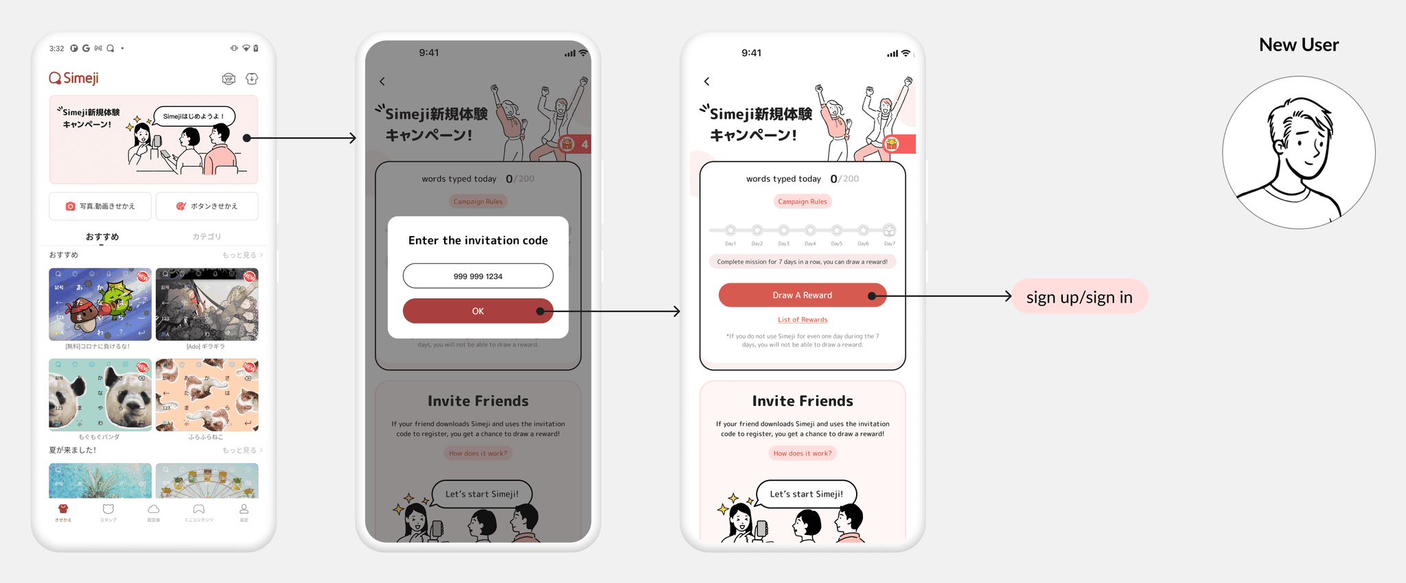
When new users launch the app for the first time, they’ll see the campaign banner at the top of screen. Tapping the banner opens the campaign homepage with a model for invitation code. The code auto fills if they used the URL from Twitter to download the app. The button informs new users that they can draw a reward. After tapping the button, new users will be asked to sign up to claim the reward.
Once the new user signs up, the next time existing user opens the campaign homepage , the button indicates that they can draw a reward.
How can users discover this campaign?
By setting 3 entry points, we aim to maximize visibility and ensure users can easily find and participate in the campaign, increasing engagement and participation rates.
Scalability on Android phones
According to our research, 60% of Simeji users are on Android, and 59% are females under 30. Many of these users have small-screen phones handed down from their parents.
To accommodate them, we optimized the interface for smaller screens, ensuring users can easily view share-out cards and briefs.
The impact
What impact we have?
User Acquisition
We saw over 500 new sign-ups per day during the campaign, with a day 1 retention rate of 70%
72% of participants invited new users in order to get rewards faster
Product Growth
Product team validated that lucky draws are effective in attracting new users.
— from Product VP
REFLECTION & LEARNING
What we’d do differently next time
Budget and User Behavior Consideration
Initially, we didn't account for budget constraints or effectively incentivize users to share the campaign.
Collaborative Planning
Conduct a brainstorming session with the product managers at the project’s start.
